Most brands start with how they want to look.
Clean. Minimal. Premium.
But very few ask a more important question:
What should this brand mean?
Because what makes a brand feel different is not its style.
It’s the culture behind it.
At W Women Wellness,
the identity did not begin as a visual.
It began as an idea: What does it actually mean to restore?
For many modern women,
the issue is not just physical discomfort.
It’s imbalance. Irregular rhythms. Constant tension.
So the identity had to express something deeper.
Not decoration.
Not trend.
But a sense of grounding.
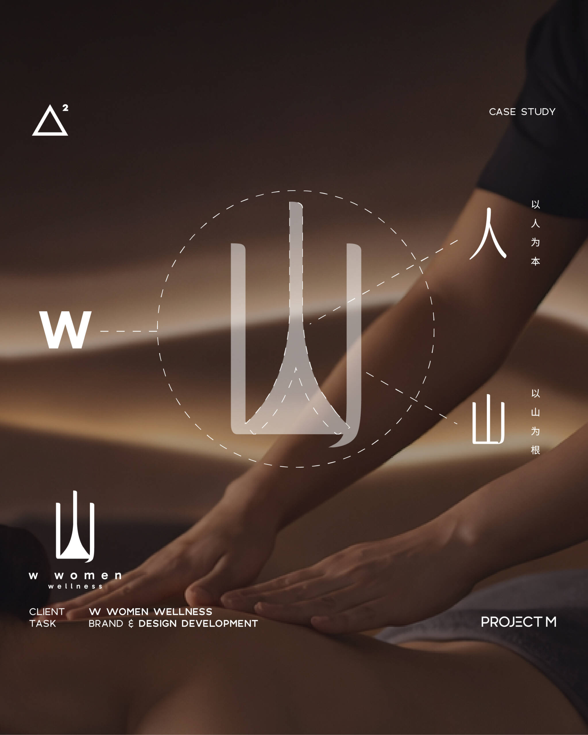
The symbol is built from three “W” forms.
At first glance, it reads as a letter.
But structurally, it forms the silhouette of mountains.
In Eastern thinking,
mountains are not just landscapes.
They are where herbs grow,
where balance originates,
where structure begins.
This is why the form is not arbitrary.
It is rooted in something cultural,
something natural,
something foundational.
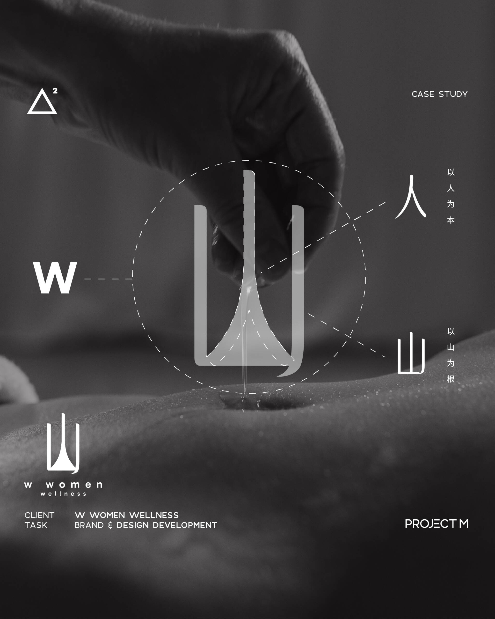
Look closer.
Within the structure, the character “人” quietly appears.
Wellness does not begin with a product. It begins with people.
This is what makes the identity different.
It is not designed to impress.
It is designed to embody the meaning of people-centered
Because a strong brand
does not start from how it looks.
It starts from what it stands for.
— Project M Group
Branding with intention.