Many wellness brands today look… fine.
Clean spaces. soft colours. Minimal aesthetics. But somehow, they still feel forgettable.
The problem isn’t how they look. It’s what they are trying to express.
Most brands begin with style.
They aim to feel premium, calm, or beautiful. But these are outcomes, not starting points.
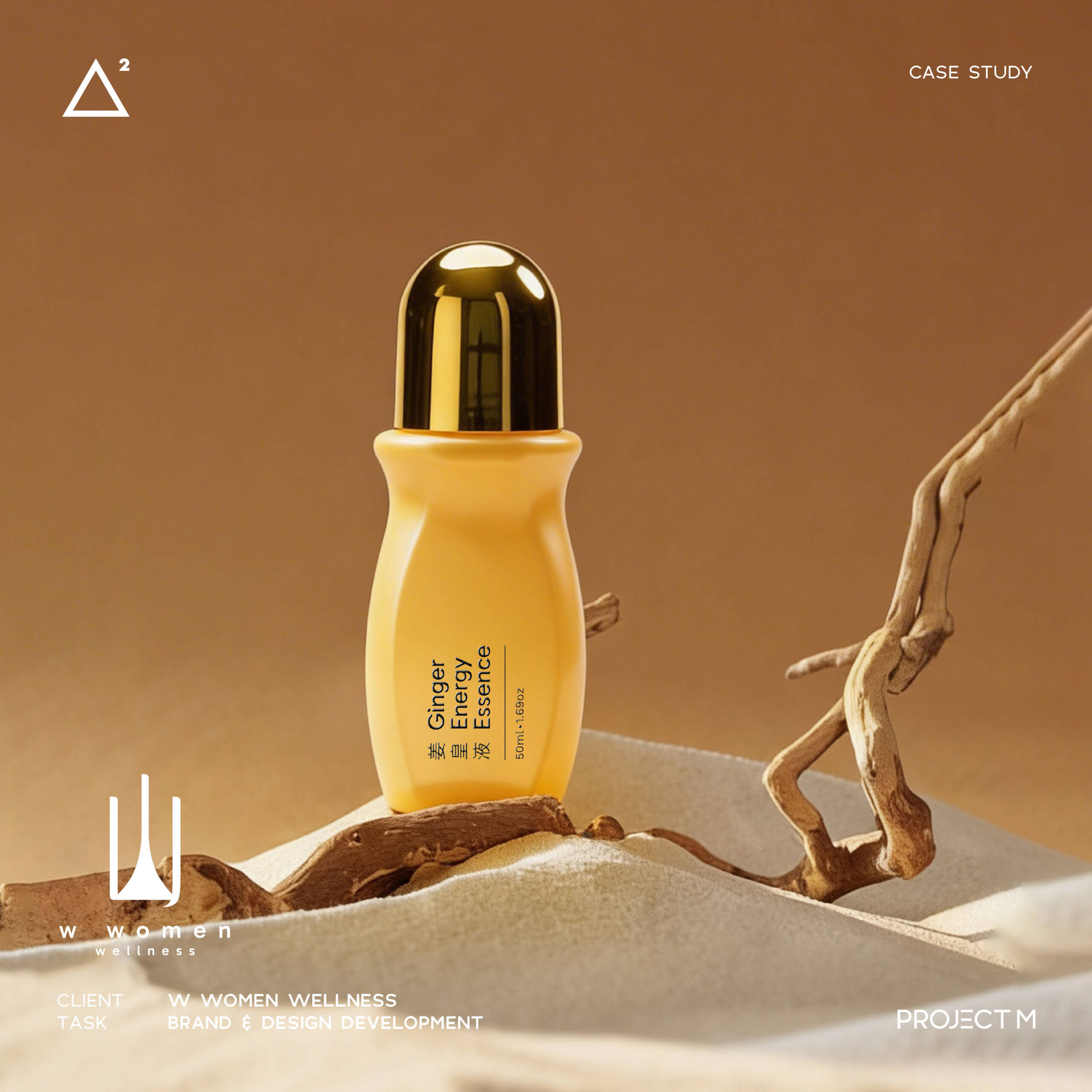
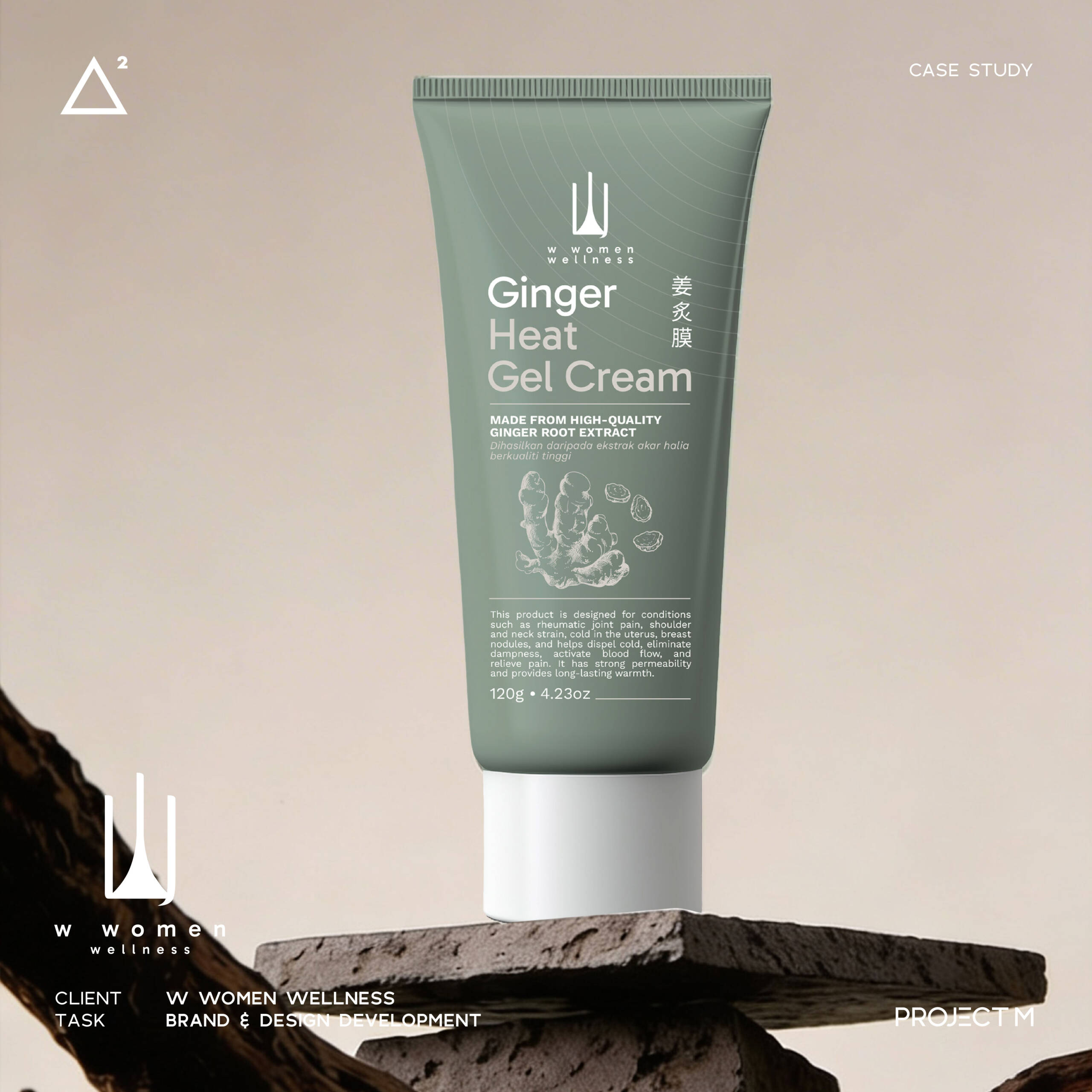
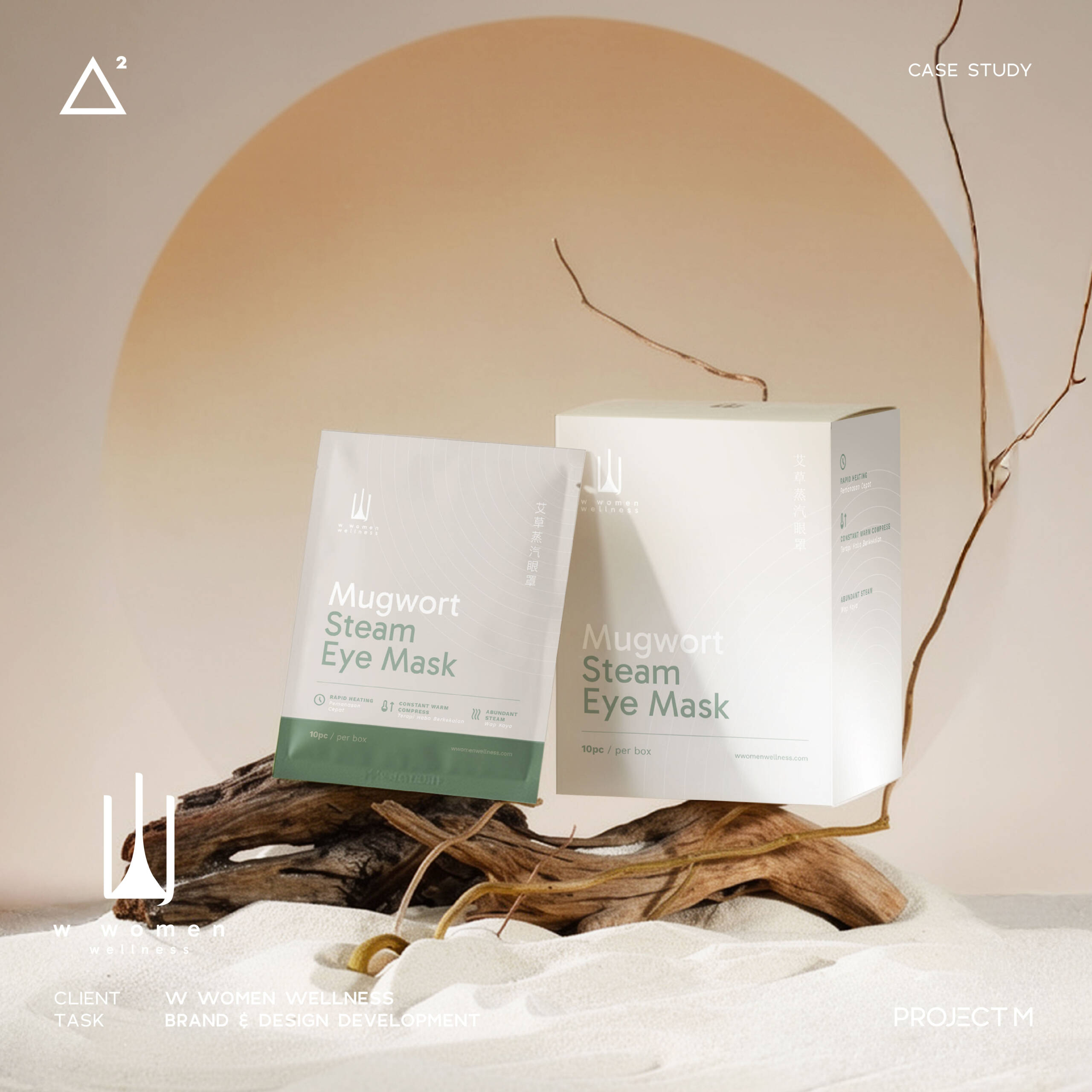
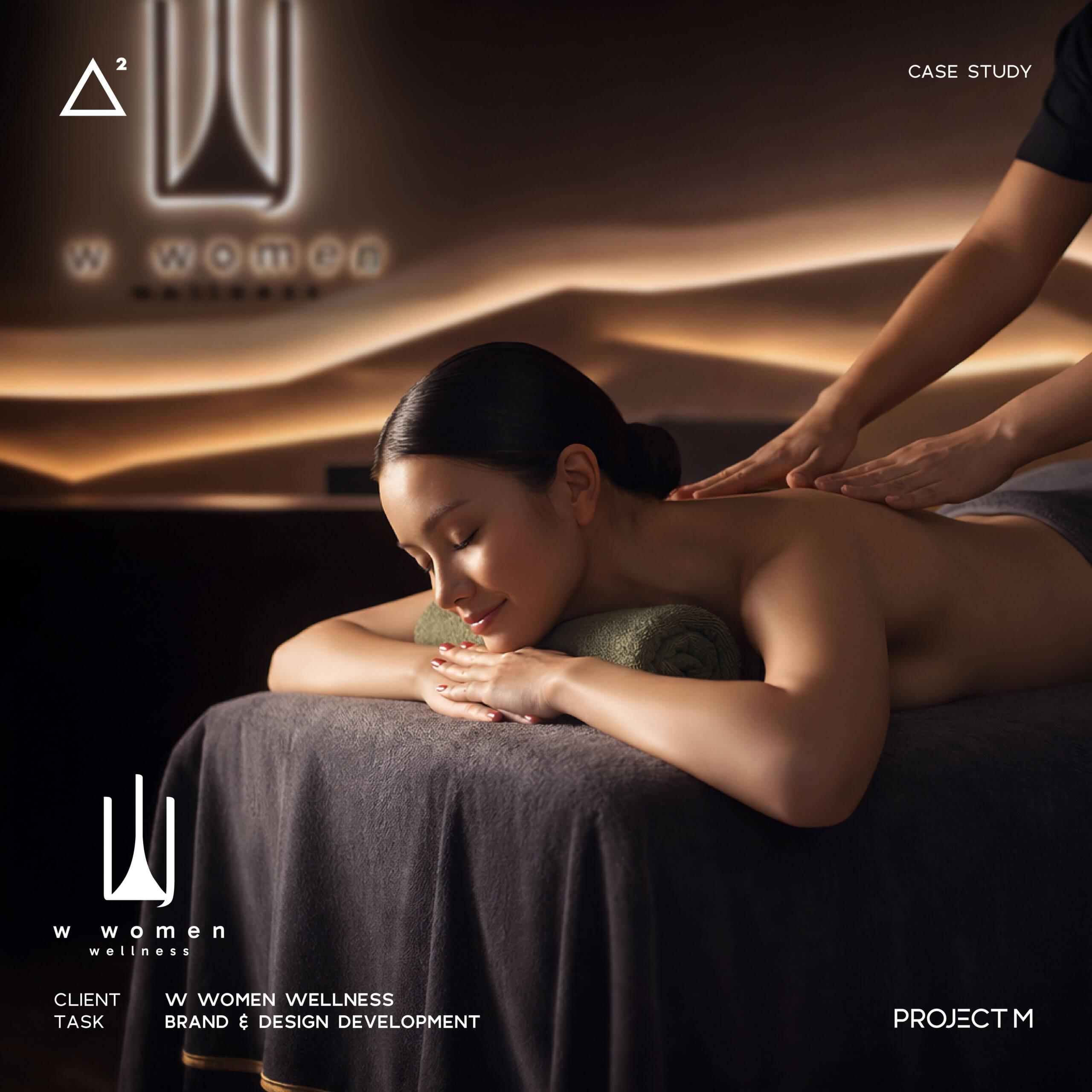
W Women Wellness began from a different question.
Not
“How should a wellness brand look?”
But
“What does it actually mean to restore?”
For many modern women, the issue is not just physical discomfort.
It’s imbalance.
Irregular rhythms.
Constant tension.
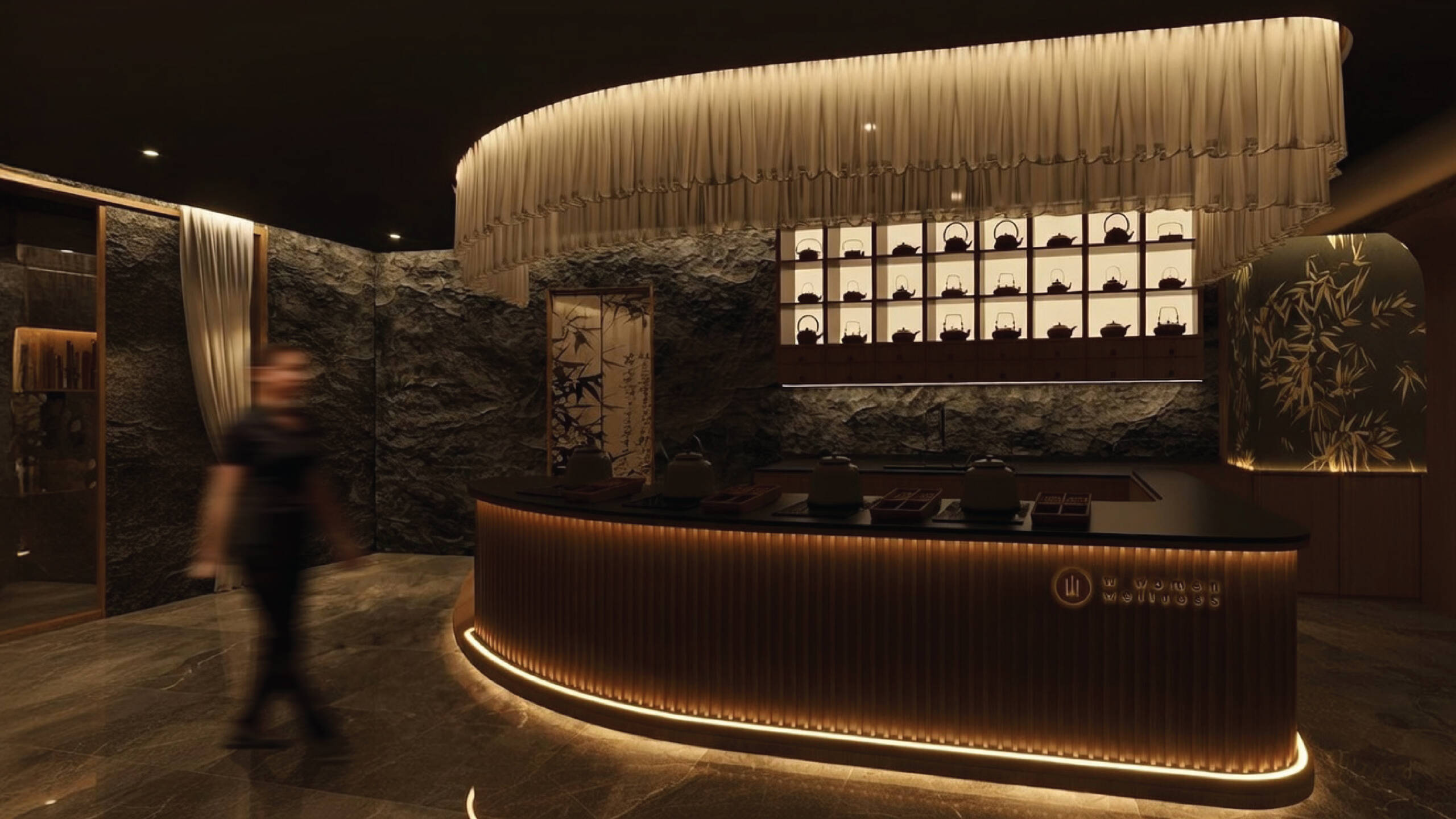
So the brand was not designed as a treatment centre, but as a space to slow down, rebalance, and reconnect.
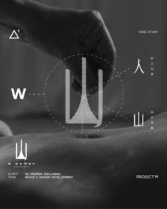
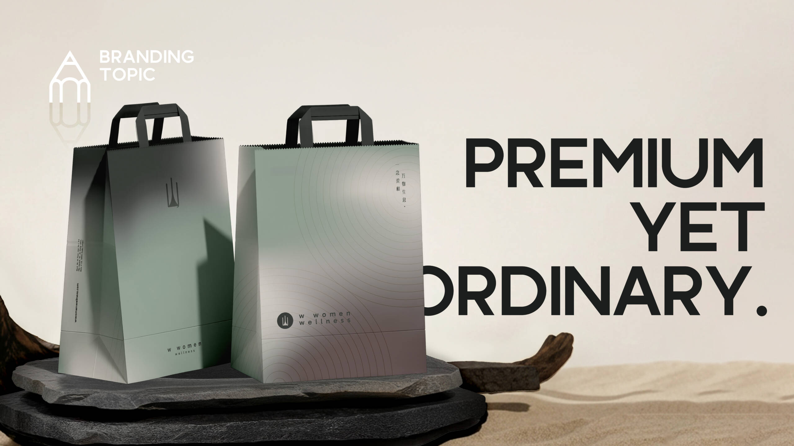
The identity is built around three “W” forms.
But it is not just a letter.
It forms the silhouette of mountains.
In Eastern thinking,
mountains are not just landscapes.
They are the source of herbal medicine,
the origin of balance,
the foundation of structure.
Within this form, the character “人” quietly appears.
A simple reminder, wellness does not begin with treatment.
It begins with people.
That is why the brand does not try to feel “luxurious” or “beautiful”.
It feels grounded.
Calm.
Intentional.
Because true restoration
is not something you see first.
It is something you feel.
— Project M Group
Branding, built with intention.