In the world of luxury branding, there is a golden rule: Simplicity is the ultimate sophistication.
At Project M, we believe that the most powerful brand identities are those that strip away the non-essential to let the core message shine. In our recent collaboration with Armani Residence, we faced a challenge: How do we translate the complex language of a high-rise development into a singular, iconic symbol?
The answer was found in two words: Less is More.
1. The Strategy: Intentionality over Decoration
A brand shouldn’t just look good; it must have intention. For Armani Residence, we didn’t want a logo that was simply decorative. We wanted an identity that felt like it belonged to the very structure of the building.
We shifted the focus from “creating a picture” to “capturing an essence.” The resulting identity is rooted in clarity, order, and a thoughtful, contemporary lifestyle.
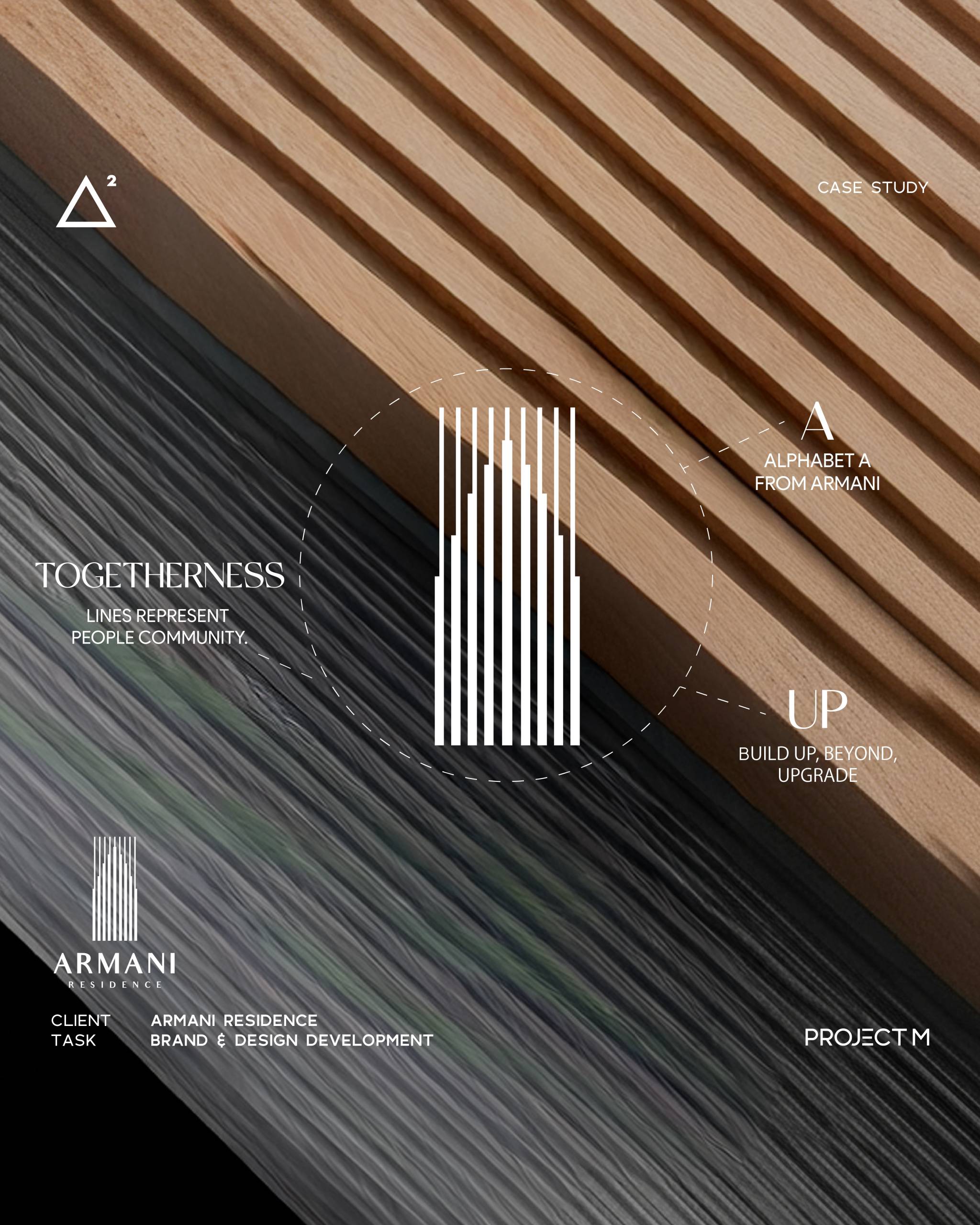
2. The Power of Line and Negative Space
Our designers used clean, structured linework to create a sense of architectural rhythm. By strategically using negative space, we achieved two goals:
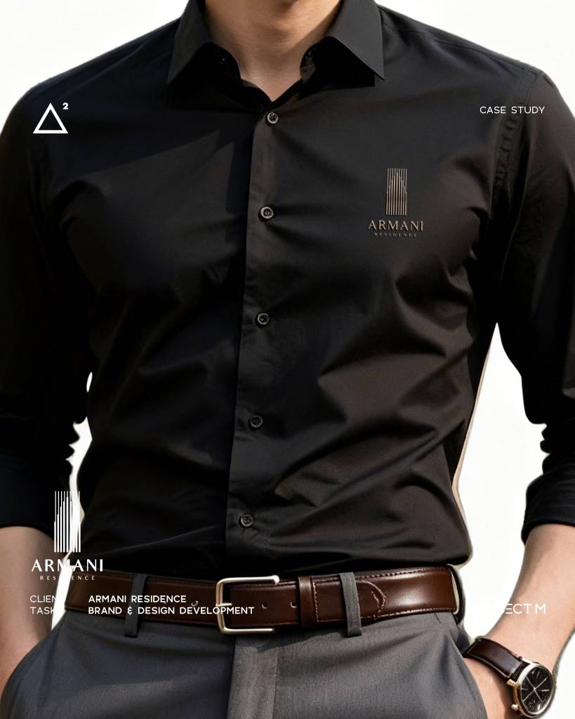
- Subtle Branding: The interplay of thick and thin strokes subtly forms the letter “A” without being literal.
- Psychology of Space: This use of ‘unfilled’ space evokes a feeling of calm and exclusivity, two highly valued commodities in high-end living.
By being minimal, the logo becomes a mark of refined taste rather than a loud declaration of wealth.
3. The Implementation: Simplicity as a Touchpoint
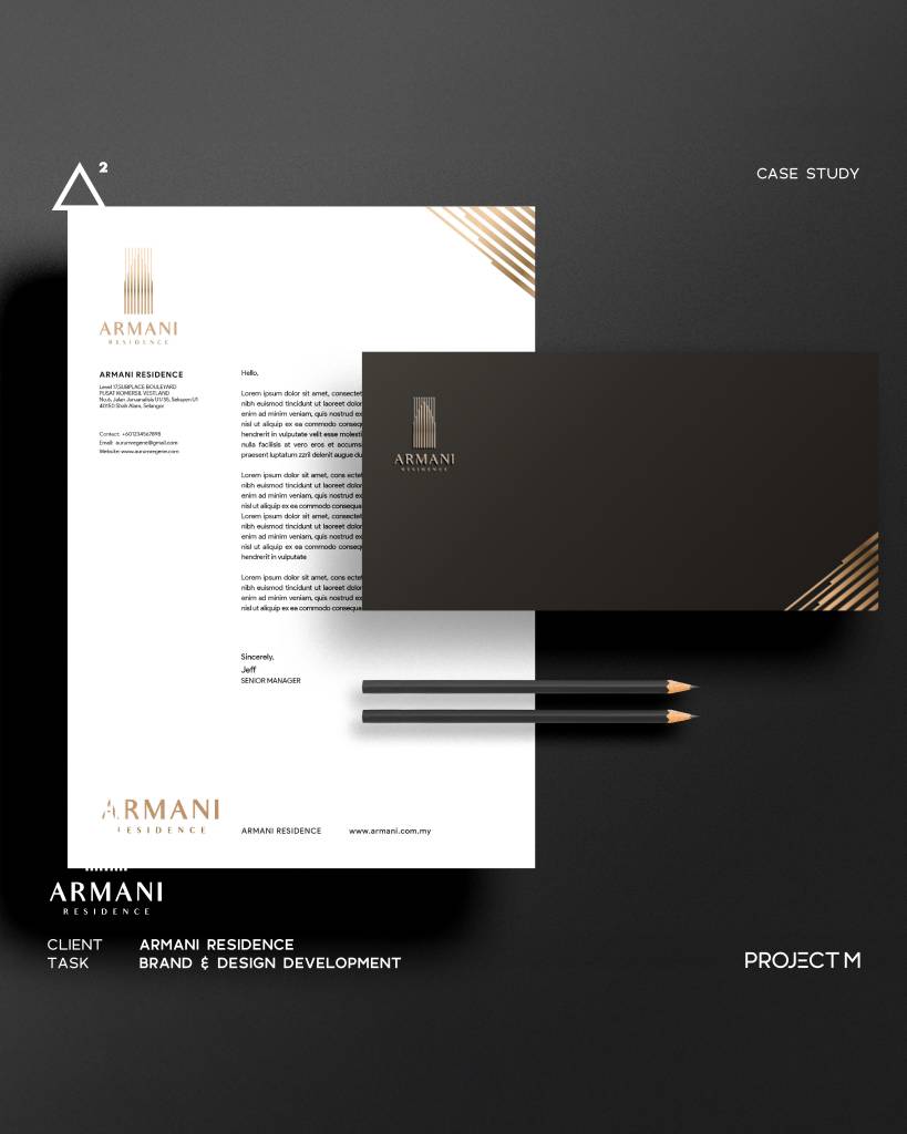
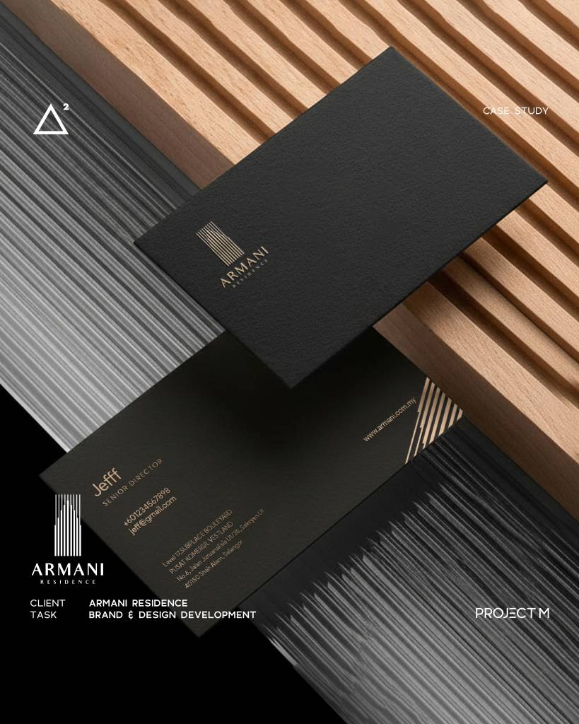
A minimal brand must perform flawlessly across all touchpoints. When an identity is this simple, every application must be precise. From corporate stationery to property signage, the design must feel curated, not merely placed.
Our approach to the physical applications was to let the minimal design and high-quality textures (like a premium gold finish) create an immediate sense of prestige.
4. A Symbol of Status: The Silent Declaration
A status symbol must feel premium in every touchpoint. Whether it’s a gold-foiled business card or a subtly branded uniform, the identity must command respect without trying too hard.
The work for Armani Residence is a testament to the idea that quiet precision is more memorable than loud spectacle. By letting the lines do the talking, we created an identity that is built to last.
Is your brand shouting into the void or speaking with a clear, resonant voice? At Project M, we can help you refine your message to its most potent and sophisticated form. Let’s talk about your next intentional brand.
— Project M Group
Branding with intention.